Anna’s Taqueria
2026
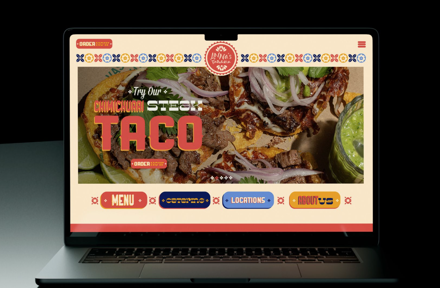
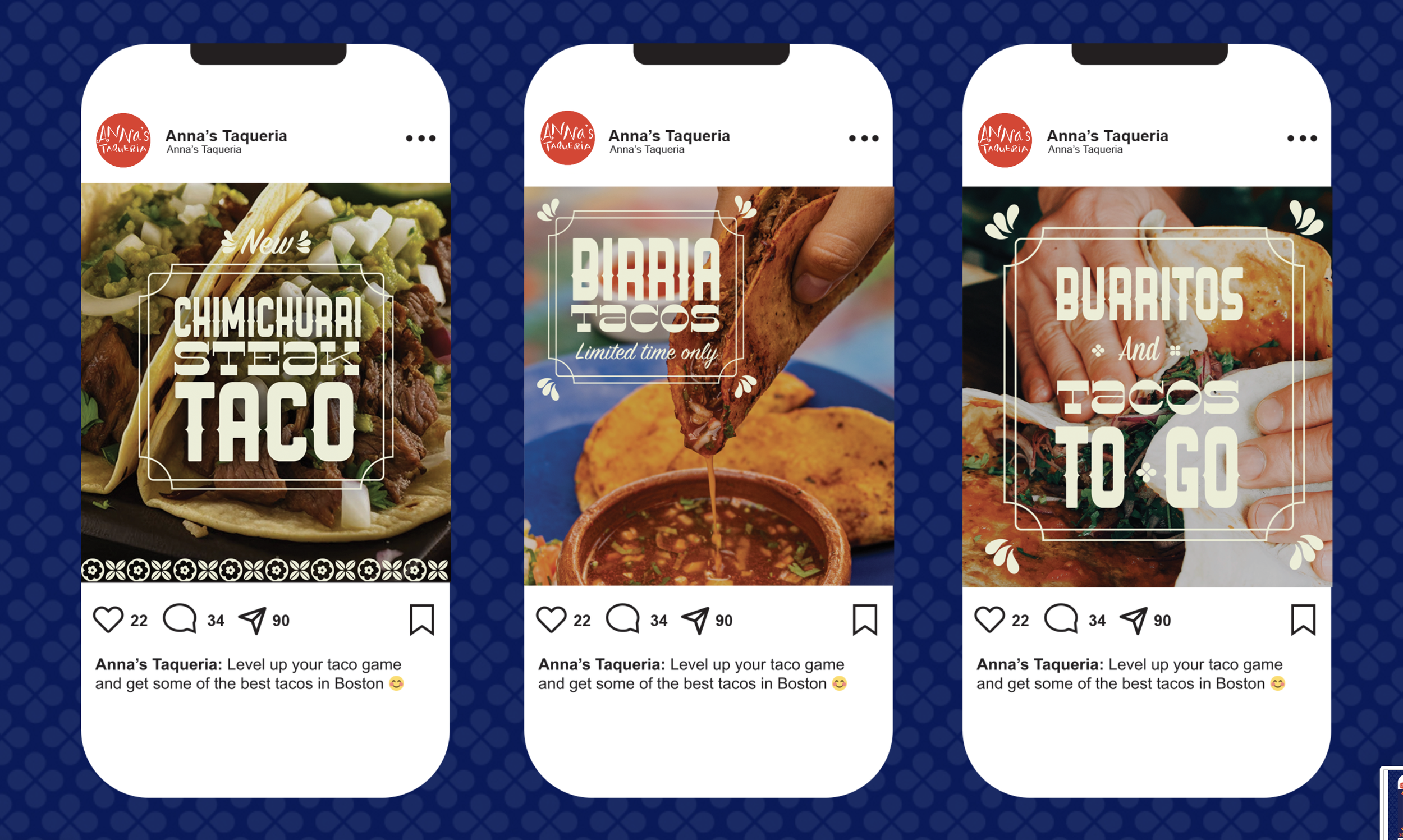
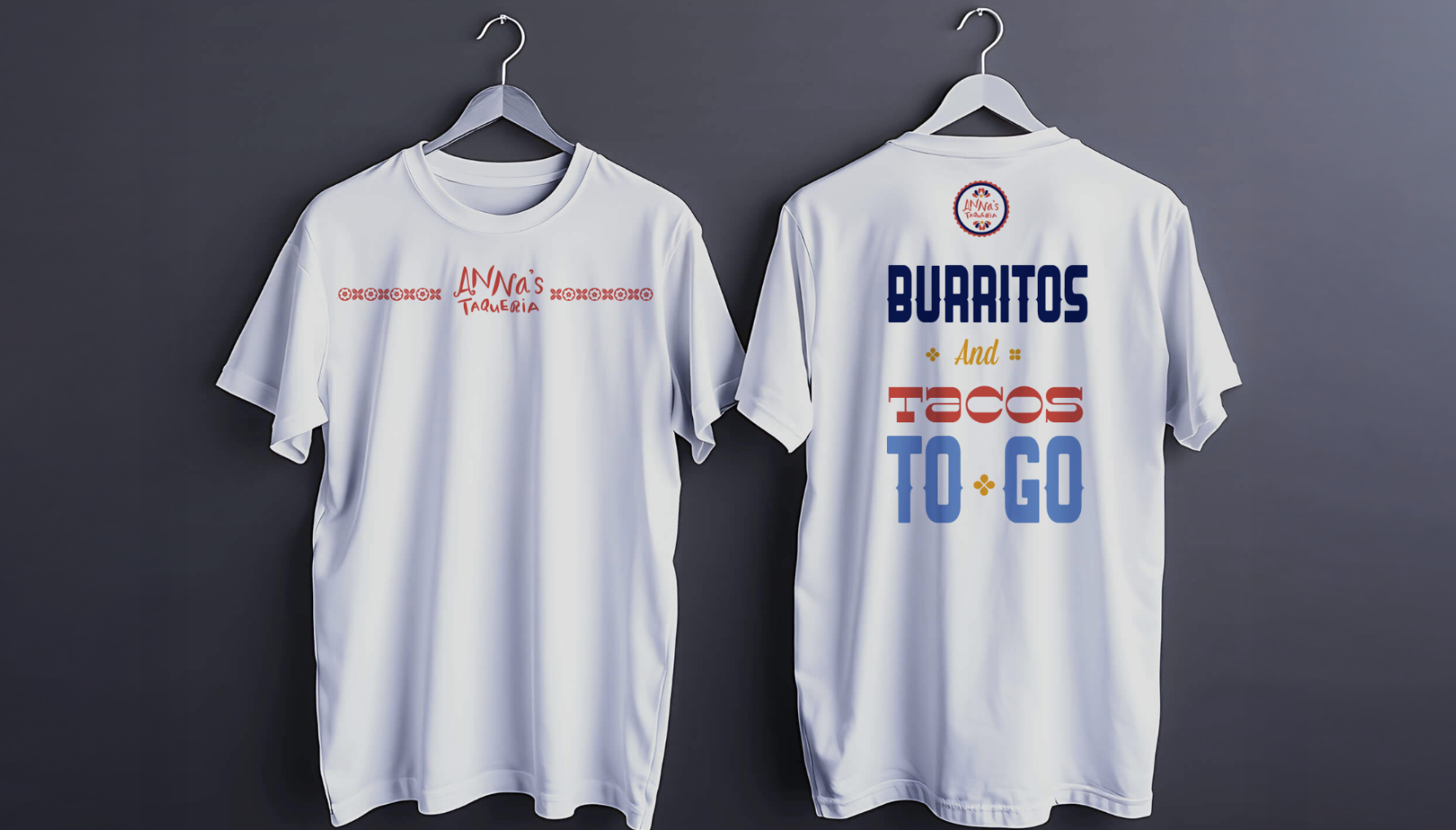
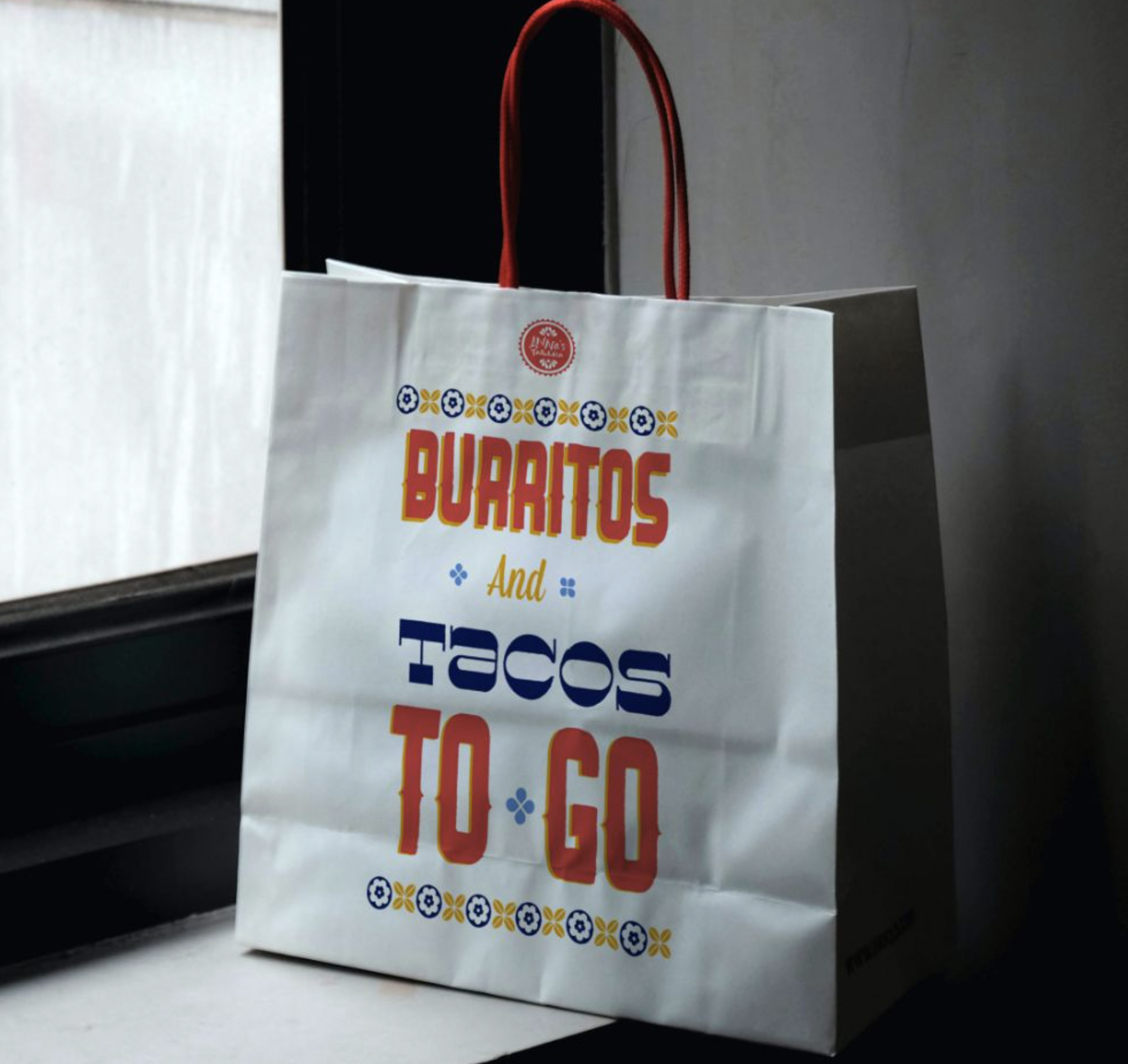
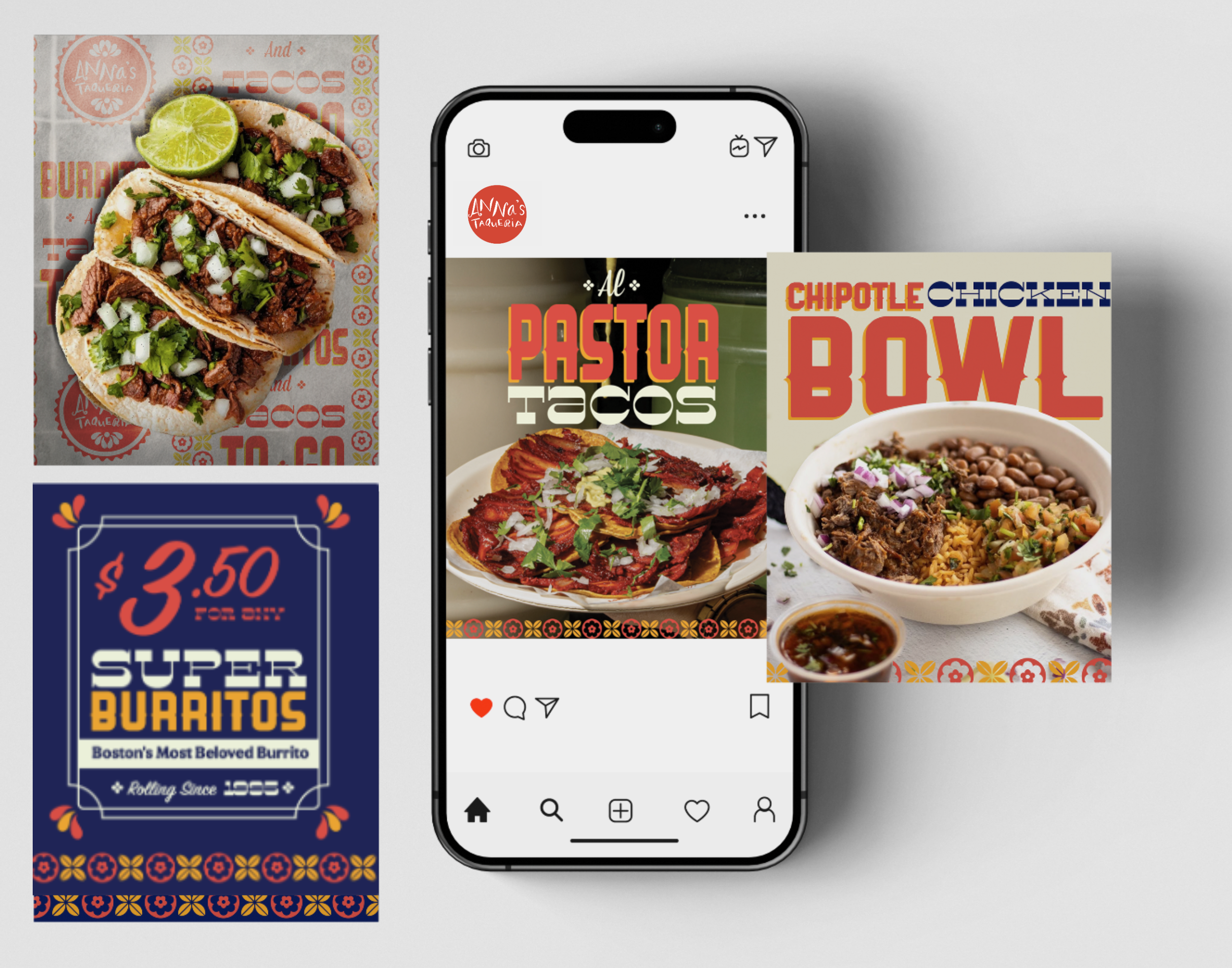
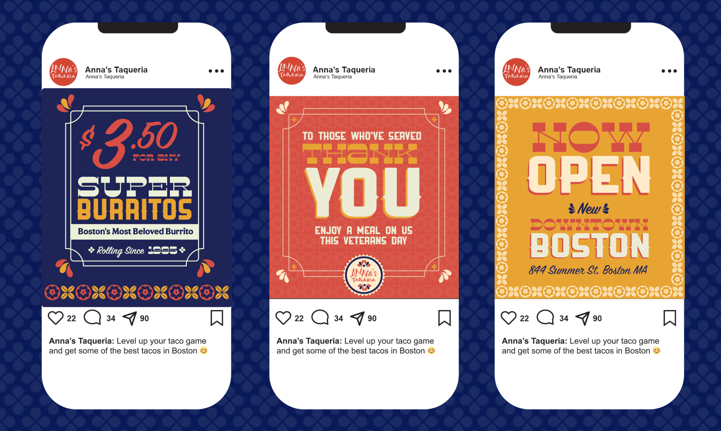
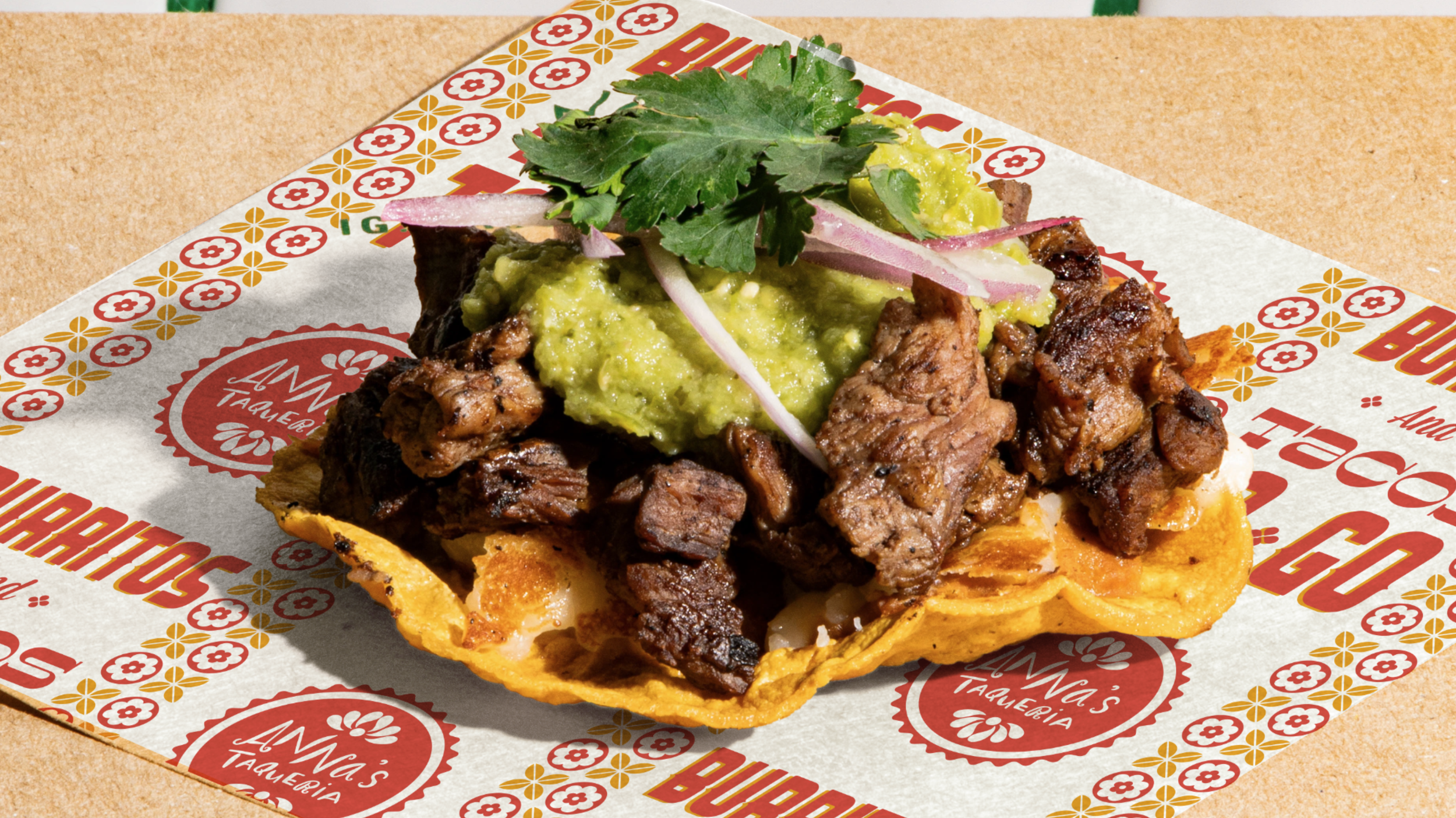
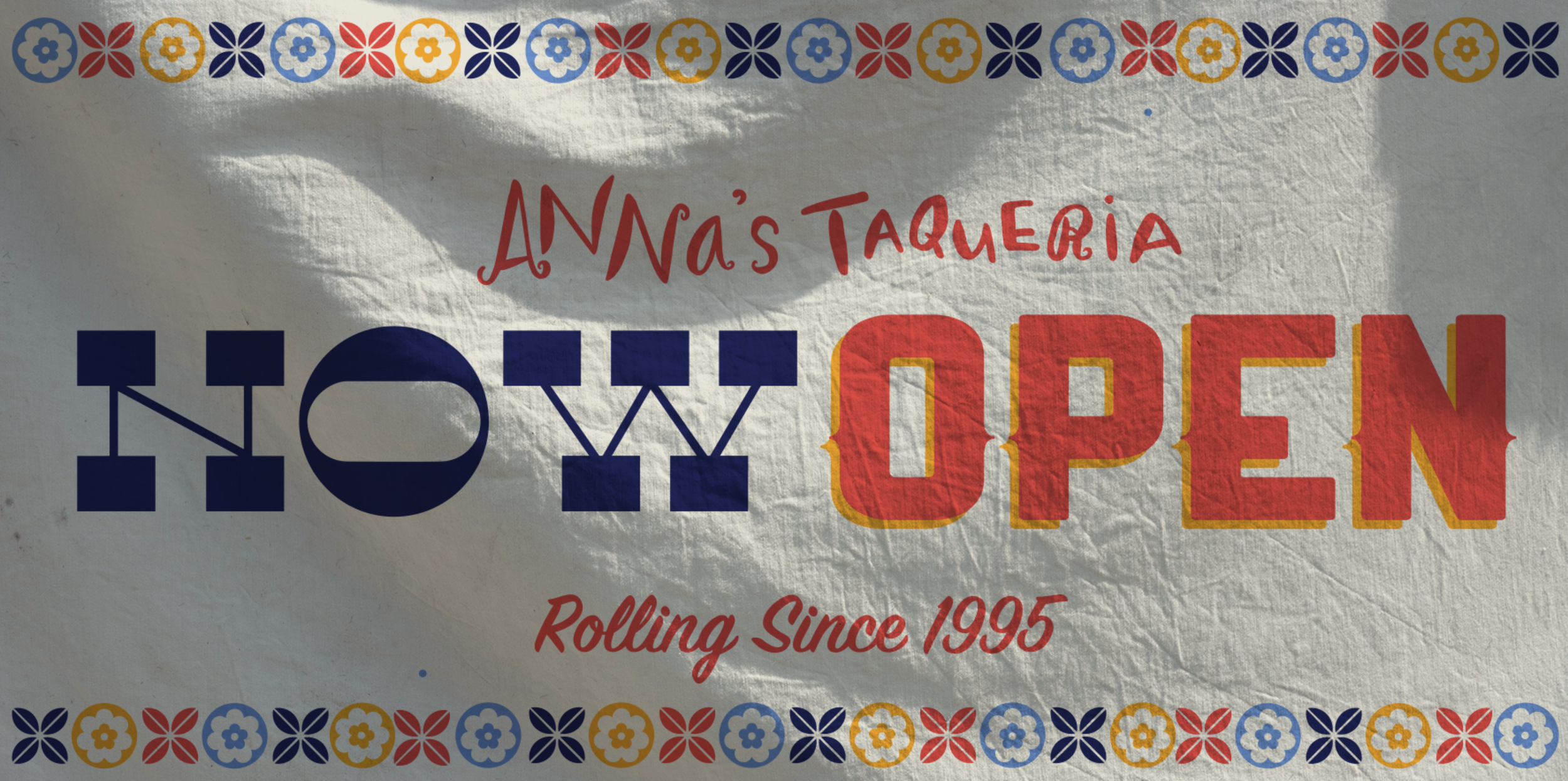
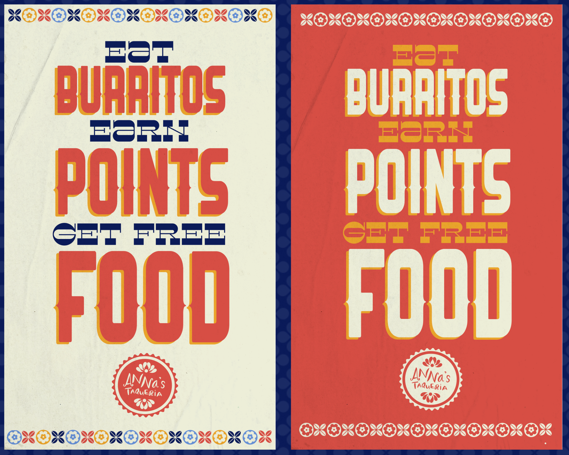
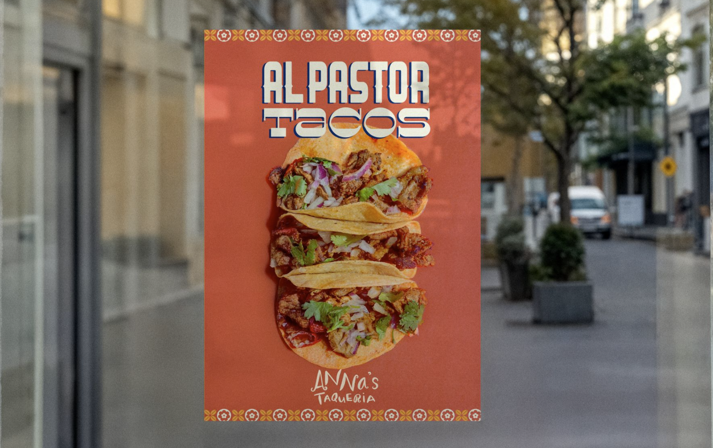
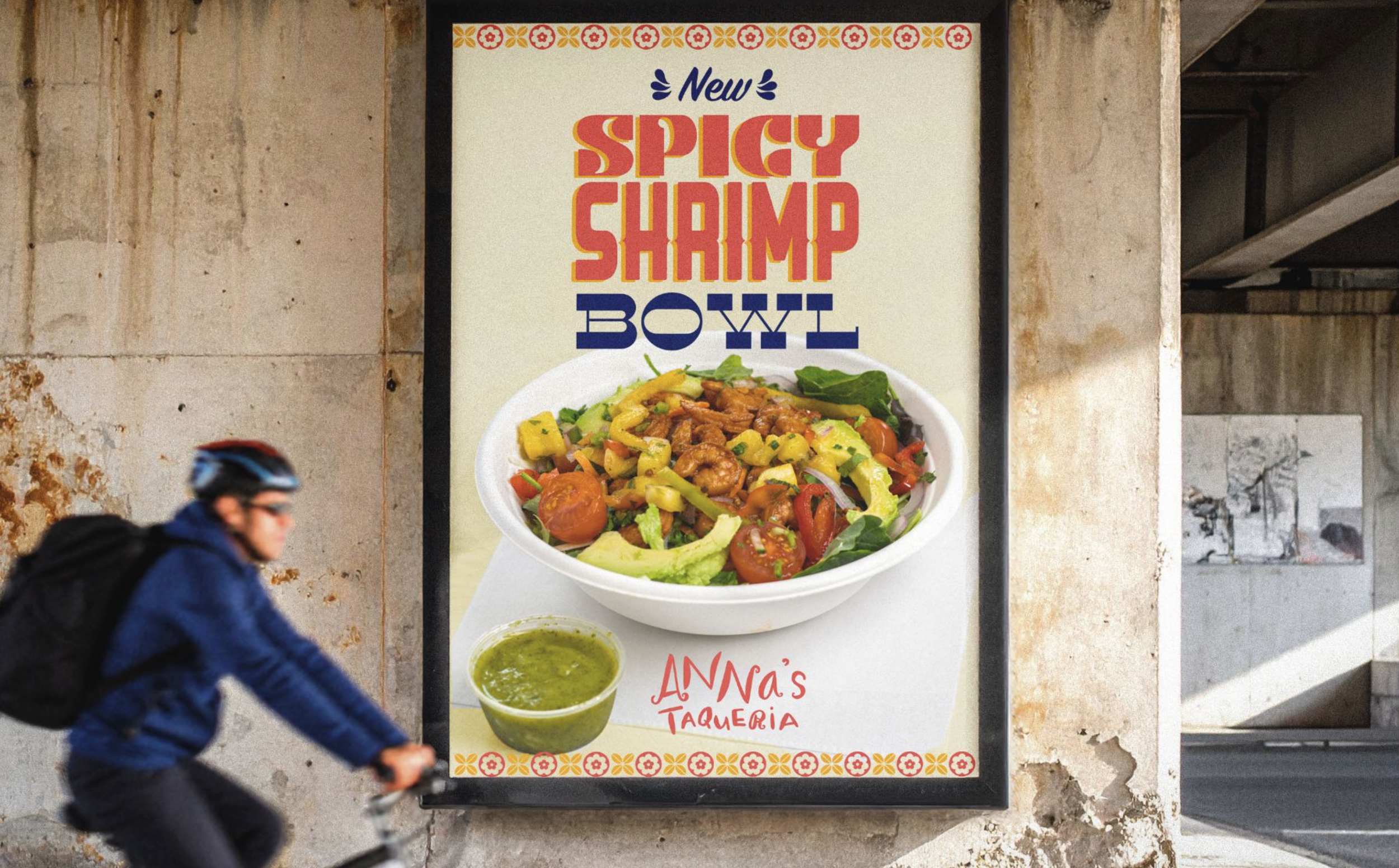
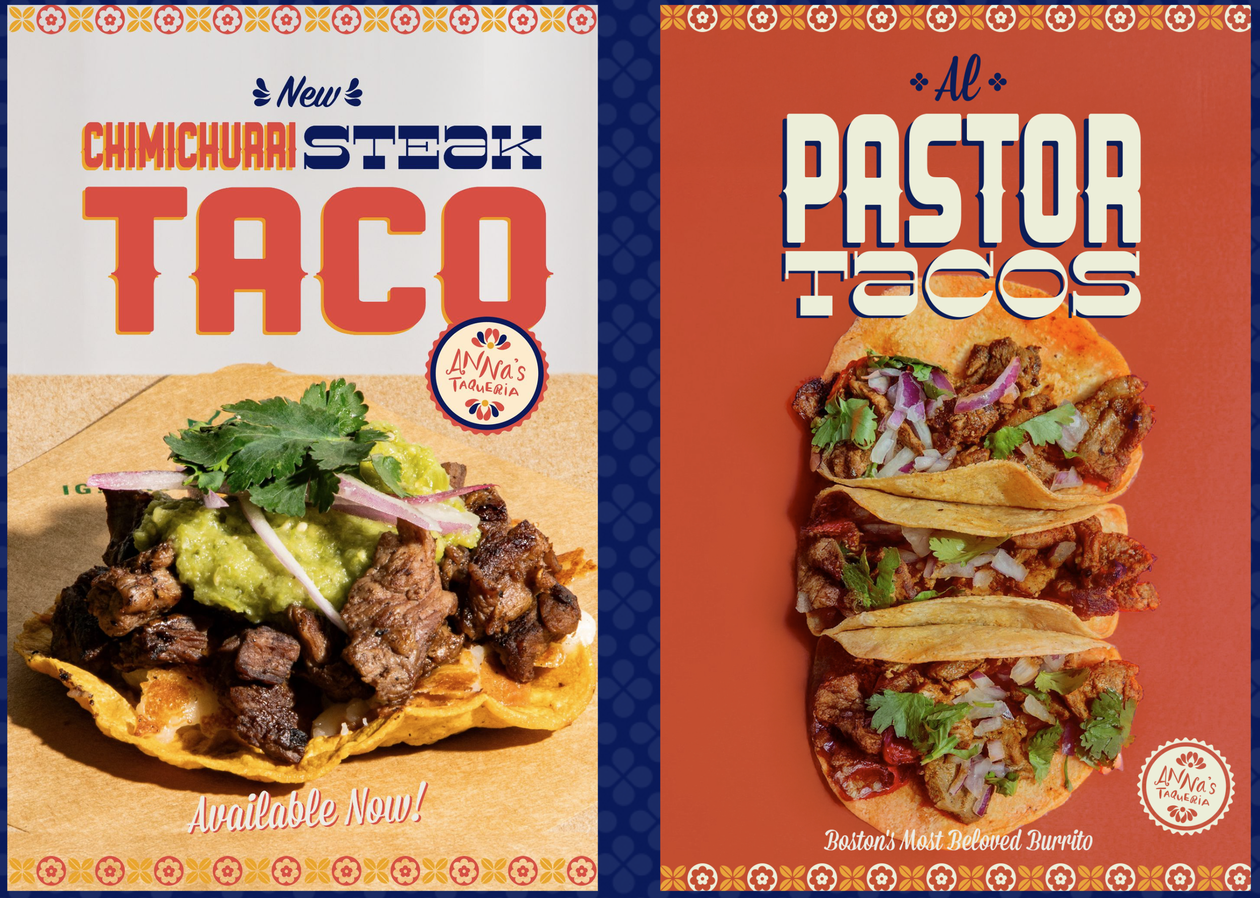
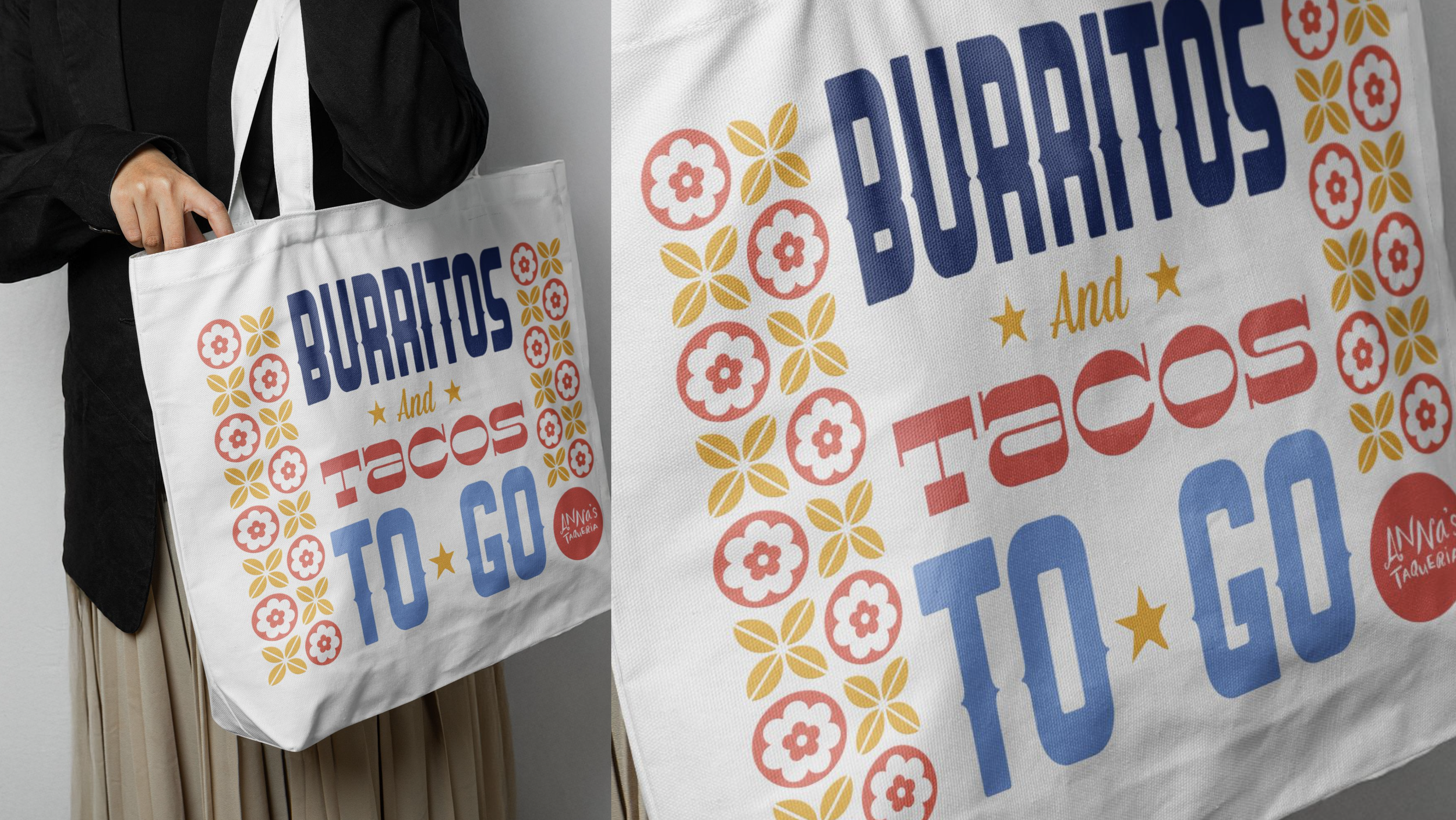
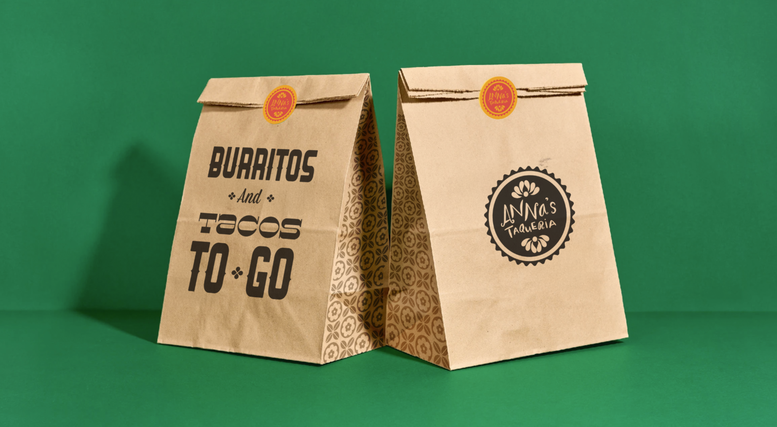
When our favorite local burrito and taco shop, Anna’s Taqueria, asked for a redesign, we dug in, both physically and creatively. They already had a logo people recognized and food people loved, but they needed a design world that felt more authentic, more ownable, and more exciting.
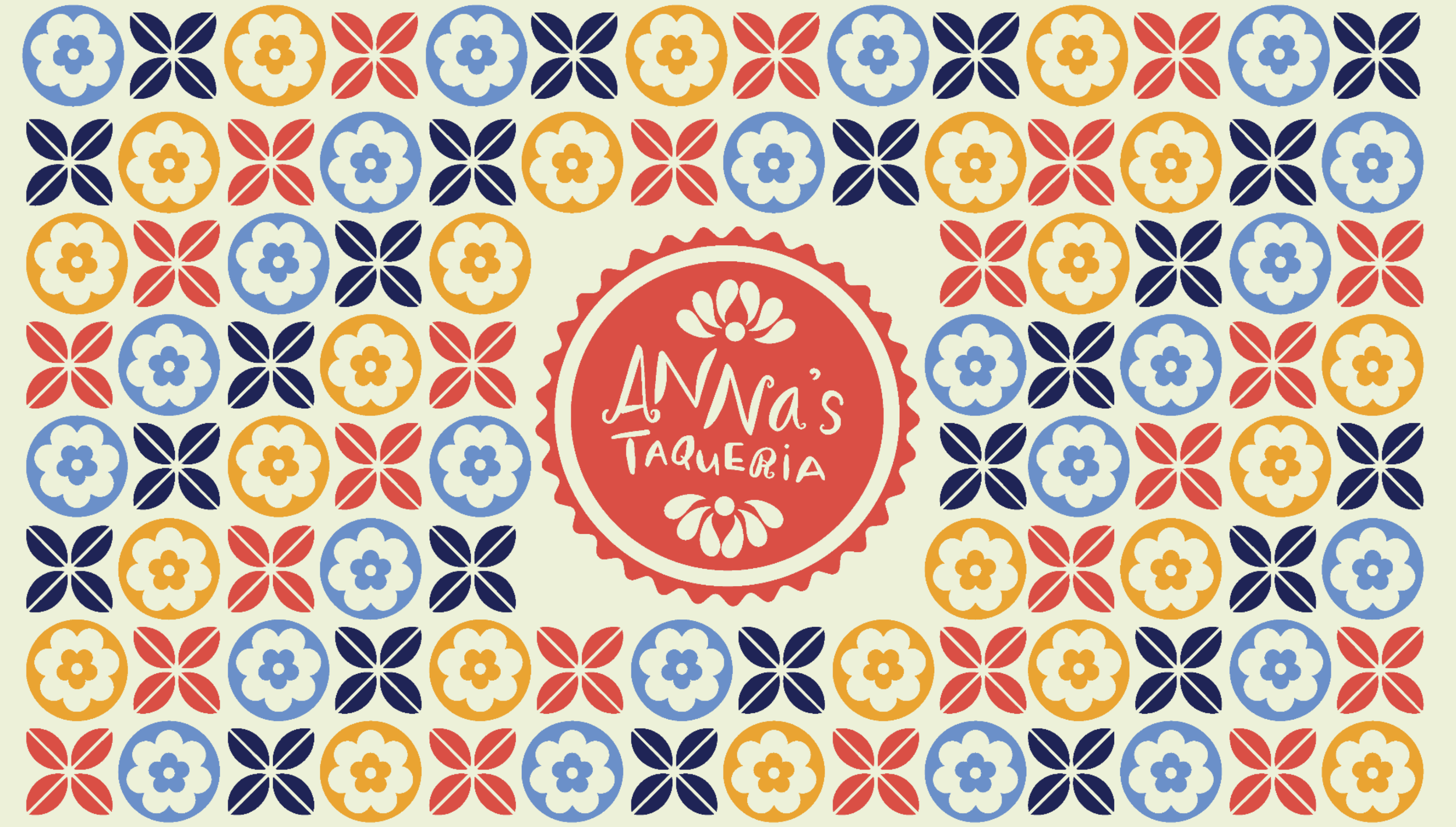
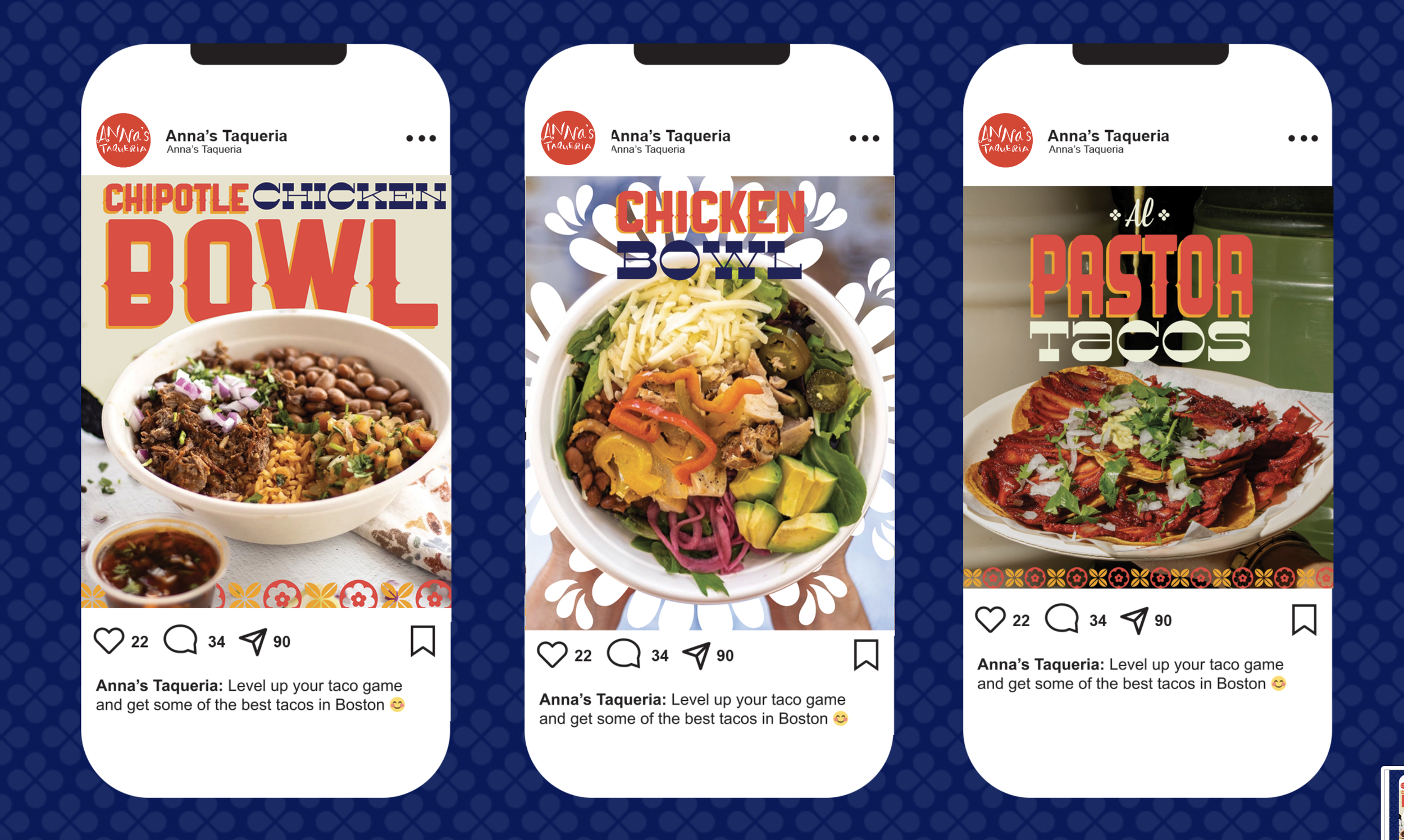
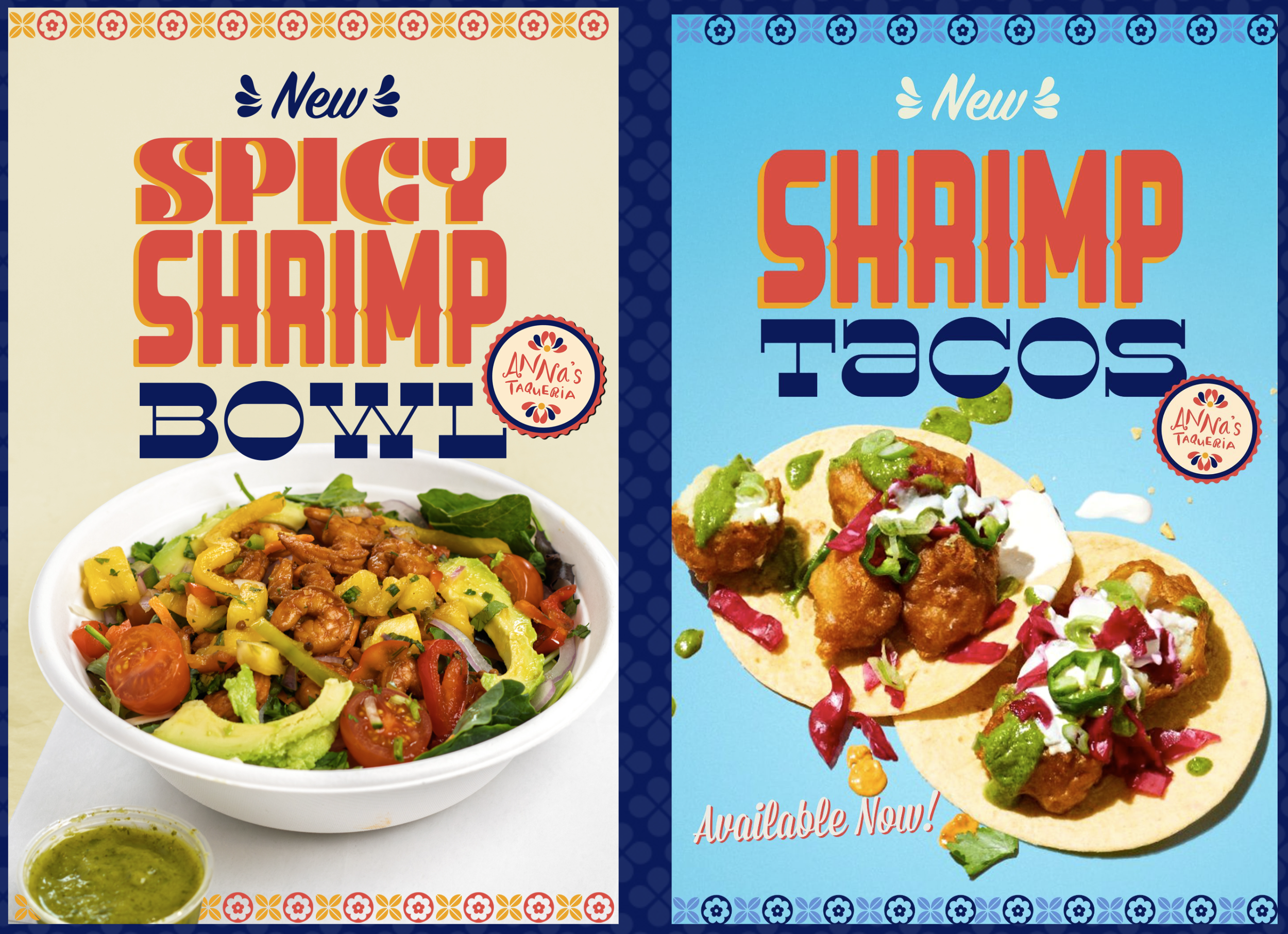
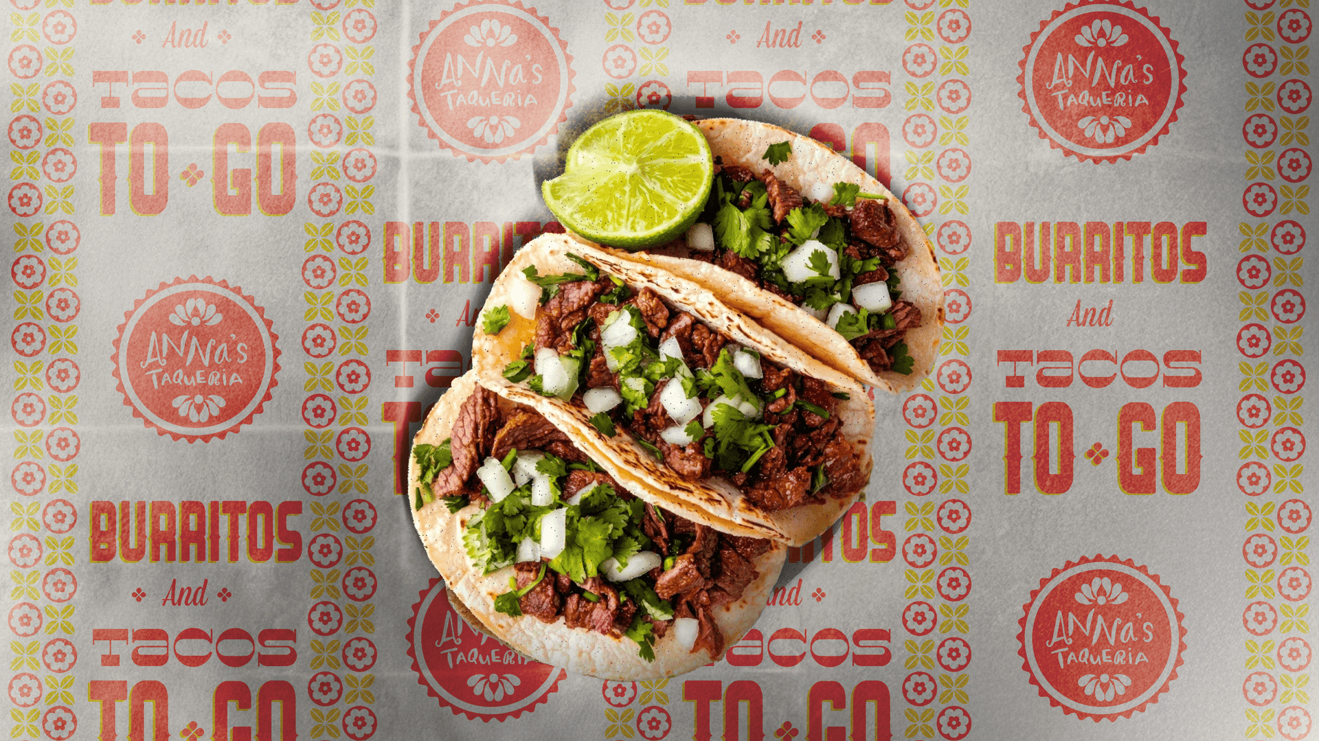
While Anna’s locations didn’t share a consistent look, they did share a consistent feeling. Eating there felt like being in someone’s kitchen, and nearly every space featured some version of talavera tile. We leaned into those truths and dialed them up. The result was a richer, more expressive system that let the food shine and evolved the brand from a static tile motif into bright, authentic colors inspired by Mexican cooking. A design world built to stand out across restaurants, merchandise, packaging, and social content.